Bed Republic - Branding
Bedding & Bath e-commerce website
Bed Republic is a bedding brand founded in 2018 by four friends, who started from a simple observation: it had become difficult to find sustainable, healthy, European and affordable bedding.
The company first developed with hotels, guest houses and professionals in Switzerland, before launching in B2C on the European market.
But despite a solid DNA (on-demand manufacturing, traceable materials, short circuits, European craftsmanship), the brand suffered from a blurred visual identity and heterogeneous discourse.
The graphic universe lacked soul, the tone of voice was not embodied and the messages struggled to reflect the founding values: boldness, authenticity, quality, commitment and respect for the environment.
The objective
Completely overhaul thegraphic and editorial identity to express Bed Republic's true personality, clarify its raison d'être and establish its upmarket yet accessible positioning.
Scope
- Brand identity
- Graphic identity
- Logo & logomark design
- Editorial charter
- Storytelling
Customer & Date
- Bed Republic
- February 2024
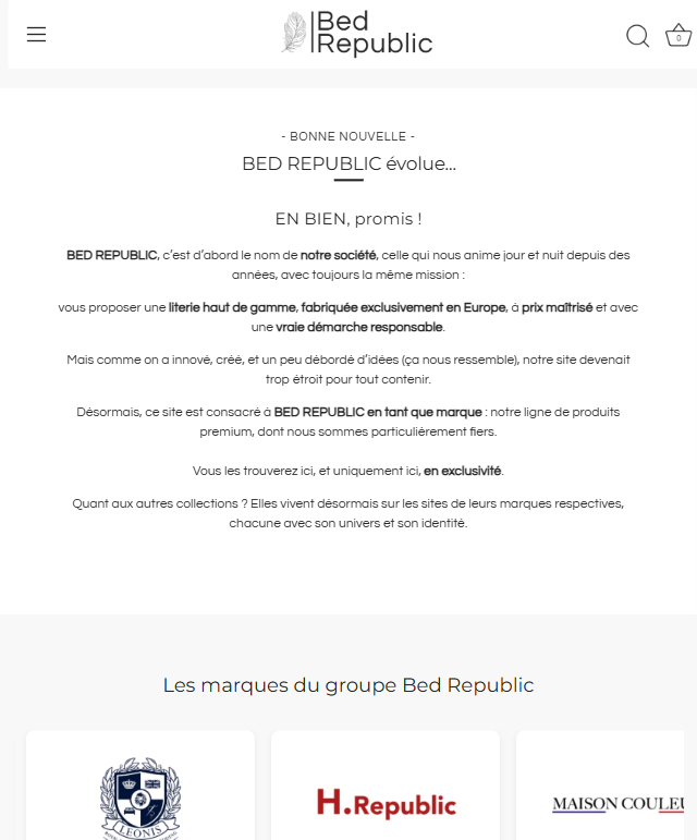
Before
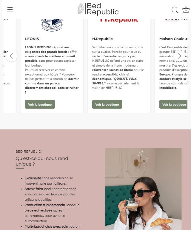
After
My mission
Recreate a coherent, elegant and deeply embodied brand identity
I helped Bed Republic completely rebuild its image, defining its graphic universe, language, discourse and editorial line.
We laid the foundations for a clearer, more human, more assertive brand, aligned with its values and long-term vision.
My actions 1/4
1. Brand platform definition
DNA, values, mission and vision clarified
Analysis of personas and real target needs
Editorial line structured around 3 pillars:
Quality & expertise, Responsibility & on-demand production, Accessibility & transparency
My actions 2/4
2. Creation of the new logo & iconic nib
The original logo didn't express the brand's warm, modern feel.
So I designed a minimalist, geometric, rounded logo, combined with a modern sans serif logotype.
The feather, integrated into the logomark, symbolizes :
lightness and comfort,
intimacy and care,
the human dimension of the brand,
the desire to tell a story: that of better sleep and more conscious consumption.


The feather becomes Bed Republic's visual identity marker.
My actions 3/4
3. Creation of complete art direction
- Color palette: a mix of premium neutrals (dark gray, grayish white) and soft companion shades (powder pink, olive, gold).
Choice of typefaces: Questrial for modern elegance, Montserrat for structure and legibility.
Definition of a coherent graphic universe for all media: website, networks, campaigns, digital packaging.
Iconographic charter: bright, human, warm, modern, everyday visuals.
#f8f8f8
#272727
#d9d9d9
#d3b4b1
#76846e
#d9ab6d
Questrial Regular
Aa
A B C D E F G H I J K L M N O P Q R S T U V W X Y Z
a b c d e f g h i j k l m n o p q r s t u v w x y z
Montserrat Regular
Aa
A B C D E F G H I J K L M N O P Q R S T U V W X Y Z
a b c d e f g h i j k l m n o p q r s t u v w x y z
4. Creation of complete editorial charter
Tone of voice: authentic, optimistic, confident, but never familiar or elitist.
Editorial guidelines: vocabulary, language levels, punctuation, page structure, web & SEO writing rules.
Brand storytelling: coherent discourse around comfort, European craftsmanship, responsibility and transparency.
Structuring content: pillar pages, editorial cocoons, SEO logic, buying guides, social networking formats.
The results
This strategic overhaul has profoundly transformed Bed Republic's image.
The brand now has a coherent, premium and memorable identity, a clear message that reflects its values, and a solid editorial base capable of supporting the growth of the site, SEO and all future communication.
The graphic universe, storytelling and tone have gained in impact, warmth and professionalism, reinforcing the brand's credibility in a highly competitive market.
A modern, elegant and coherent graphic identity, supported by a strong logo and an instantly recognizable symbol (the feather).
A clear, sincere and differentiating brand message, finally aligned with our core values.
A structured editorial line, capable of guiding all future communications: website, networks, emailing, videos, campaigns.
A unified approach to all communications, bringing greater professionalism, meaning and coherence.
A solid foundation for the redesign of the e-commerce site, SEO development and future marketing campaigns.